The first v0 draft made me smile. Then it made me nervous.
It looked good too quickly.
If you have been building and publishing online for a long time, you know that feeling. A design appears on screen and part of you wants to celebrate. Another part of you starts quietly asking: what is this hiding?
I have been publishing Feisworld since 2014. The site is not a new little project with five pages and a clean folder structure. It carries the Feisworld Podcast, YouTube videos, a documentary, personal essays, product tutorials, brand partnerships, affiliate links, old WordPress decisions, and years of small choices that made sense at the time.
So when v0 by Vercel helped us create a page that felt modern in minutes, I had two reactions at once.
Wow, this is powerful.
And also: please do not let this become generic.
That tension became the real lesson of this redesign. v0 helped us move faster. It helped us see ideas sooner. It helped us design and test interface patterns without waiting days for every first draft. But it did not know Feisworld the way I know Feisworld. It did not know which stories needed to stay visible, which parts of the archive had become stale, or why a page can look beautiful and still feel wrong.

Why I Wanted a Modern Site, Not a Trendy One
We have migrated Feisworld before.
Years ago, we moved from Squarespace to WordPress because the site needed more flexibility and better performance. That migration was important, and it helped us grow. But some old content stayed a little messy. Some blocks looked strange. Some legacy formatting survived because fixing every old post by hand would have taken forever.
This time, I did not want another redesign that only looked good from the outside.
I wanted a site that could carry 15 years of work more clearly. I wanted our blog, podcast, YouTube work, documentary, brand partnerships, and AI visibility work to feel connected. I wanted people to understand Feisworld faster, whether they arrived from Google, YouTube, ChatGPT, Perplexity, a partner page, or one old podcast episode they found from years ago.
That is a harder problem than “make the homepage prettier.” A modern content site has to do several things at the same time:
- Welcome new readers without erasing the history.
- Make old content easier to find and trust.
- Help AI systems understand the brand accurately.
- Keep the writing and editing process familiar enough that the team can still work.
- Give us technical control over performance, schema, redirects, images, and publishing.
v0 was helpful because it let us explore the visible layer quickly. But the visible layer was only one layer.
Underneath, we rebuilt Feisworld with headless WordPress, Next.js, Turso, Vercel, and our own Ops dashboard. We explain the publishing system here: Headless WordPress with Next.js: Our Human-Reviewed Publishing System.

Where v0 Helped Me the Most
The official v0 documentation describes v0 as an AI agent that helps people create real code, full-stack apps, and live prototypes. That matched how it became useful for us.
v0 was strongest when the question was something I could see.
- Does this homepage feel too corporate?
- Does this card help people scan the archive?
- Does this button feel like Feisworld or like a SaaS template?
- What happens on mobile when a title gets long?
- Can a partner page show proof without becoming a wall of logos?
Those are not abstract questions. They are the little decisions that make a site feel alive or forgettable.
v0 helped us with:
- Page structure and layout exploration.
- Responsive sections for desktop and mobile.
- Buttons, cards, tabs, filters, and dashboard controls.
- Empty states, loading states, and awkward states people often forget.
- Quick comparisons between different design directions.
- Turning rough ideas into something we could inspect in a browser.
The best part was not that the first version was perfect. It rarely was. The best part was that I could react to something real.
I could say, “this is too cold.”, or, “this section needs to feel more editorial.”, or, “This is polished, but it does not sound like us.” That kind of reaction is valuable. It moves the conversation out of theory.
What v0 Could Not Know About Feisworld
v0 could help us design faster. It could not decide what the site had earned the right to say.
That is a strange sentence, but I mean it very literally.
Feisworld is not built on slogans. It is built on years of interviews, tutorials, experiments, partnerships, mistakes, travel, production work, podcast editing, YouTube filming, late-night writing, and the quiet work of making things before anyone knows whether they will matter.
A tool can help me display the proof. It cannot understand the proof by itself.
It does not know why the documentary matters to me. It does not know what I learned from interviewing Seth Godin, Steve Wozniak, Arianna Huffington, Chris Voss, Mark Cuban, Dorie Clark, and hundreds of other guests. It does not know why my work with Adobe and Xiang Li Art has changed the way I think about culture, AI, and creative tools. It does not know why I care so much about making complex technology feel human.
It also does not know the boring but important parts: which old URLs should redirect, which pages need canonical tags, which images are stale, which posts should be refreshed, which affiliate links are safe, which schema fields should be trusted, and which claims need sources.
That is why I do not like the idea that this was a “one prompt” redesign.
It was not. It was a guided build. AI helped with speed, scaffolding, design ideas, curation passes, and review. But the decisions stayed human.
How We Kept the Design From Looking Like Everyone Else
AI tools can make things beautiful very quickly. They can also make things feel strangely familiar.
The same big hero. The same shiny cards. The same vague headline. The same gradient. The same “transform your workflow” language. The same website that looks like it could belong to anyone.
I did not want that for Feisworld.
We used our brand kit as a guardrail: color, typography, logo behavior, spacing, and overall visual rhythm. But the deeper guardrail was taste.
Feisworld is a media company. It should invite reading. It should make discovery easy. It should help people move between blog posts, videos, podcast episodes, partner work, and service pages without feeling lost.
It should not hide the work behind decoration.
So we kept asking:
- Can someone understand what Feisworld does without reading a manifesto?
- Can a brand partner see proof without feeling like we are shouting?
- Can an old podcast interview still feel connected to the company today?
- Can an AI system retrieve the right entity pages and understand who we are?
- Does this design make the archive easier to navigate, or only prettier?
Some good-looking ideas failed those questions. We let them go.
The 15-Year Archive Was the Real Test
A new website is easy to romanticize.
An old archive is less romantic. It has memory. It has old images, plugin leftovers, embedded videos, odd formatting, outdated categories, affiliate links, shortcodes, redirects, and sentences that belonged to a different chapter of the business.
That archive was the real test.
During the migration, AI helped us run content curation passes across old posts. It helped surface inconsistencies, formatting problems, stale metadata, and patterns that would have been painful to find one by one. Then we reviewed the findings and built specific fixes around what we actually found.
This is where AI felt most useful to me: not as a magic writer, but as a tireless assistant that could help us see the shape of the work.
The goal was not to erase the old Feisworld. The goal was to carry it forward with more care.
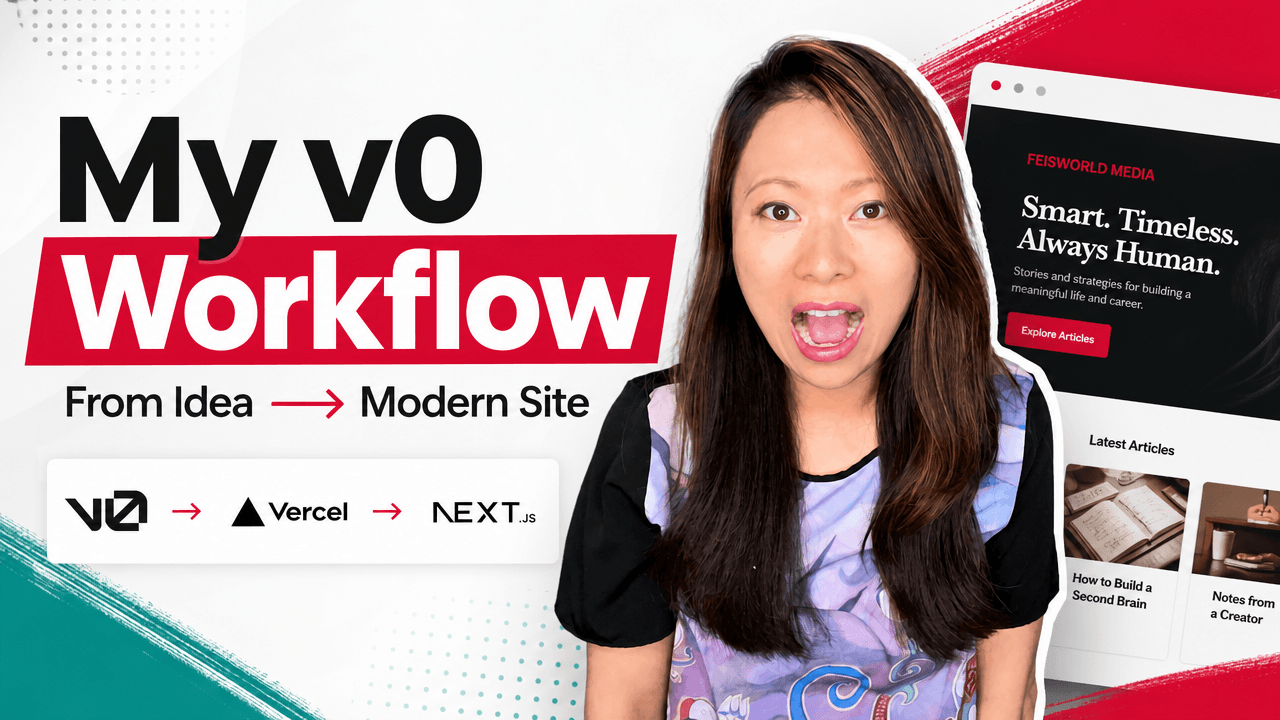
Our v0 Workflow
The workflow that worked best was simple:
- Decide what the page or component needed to do.
- Give v0 a narrow prompt.
- Review the result visually.
- Adjust layout, copy, spacing, and states.
- Move the useful parts into the real Next.js codebase.
- Test the page in the browser.
- Review performance, accessibility, content fit, and brand fit.
Small prompts worked better than giant ones. Clear decisions worked better than vague wishes. Human review worked better than asking for one more variation forever.
That last part is important. AI can make you feel productive while you are actually wandering. You keep asking for another version, another polish pass, another layout, another fix. Suddenly you have twenty options and no decision.
We tried to avoid that. Not perfectly. I still went down a few rabbit holes. But the healthiest workflow was always the same: small task, visible output, human decision.

Feisworld Tip
If you want to use v0 for a serious website, do not start by asking it to build the whole site.
Start with one real problem.
A homepage hero. A blog card. A comparison table. A dashboard filter. A mobile section that keeps breaking. A call-to-action block that feels too stiff.
Then review the result like a human being who has to live with it.
- Does it help?
- Does it sound like you?
- Can you maintain it?
- Would you still be proud of it six months from now?
The Caveat: A Pretty First Draft Can Hide Weak Decisions
This is the part I would say to any creator or brand considering v0.
A beautiful first draft is still a first draft.
It can look polished before the content model is settled. It can look modern before the SEO is right. It can look complete before the redirects work. It can look on-brand before the writing actually sounds like you.
For Feisworld, v0 was worth it because we had strong human direction around it. We knew what we wanted the site to become. We had a brand kit. We had a technical plan. We had a reason to use Next.js and Vercel. We could inspect the code, test the site, reject output, and keep the final call with people.
That is my honest v0 website builder case study.
v0 helped us build faster.
But the site became Feisworld because we kept asking what Feisworld needed to say.
FAQ
Can v0 build a real website?
Yes. v0 can help create real website interfaces and production code, especially for React, Next.js, Tailwind, and Vercel-style workflows. The more important question is whether you have the direction, review, testing, and maintenance habits to turn that output into a site you trust.
Is v0 only for developers?
No. v0 can be useful for founders, marketers, creators, designers, and product teams because it makes interface ideas visible quickly. But for a serious public site, technical review is still valuable. In our case, v0 worked because we combined visual direction with engineering review.
Did v0 replace your designer or developer?
No. v0 helped us explore design and interface options faster. It did not replace brand judgment, editorial direction, architecture, testing, content curation, SEO decisions, or final code review.
Would I use v0 again for a content-heavy site?
Yes, but I would use it the same way: small tasks, clear context, strong brand guardrails, and human review. For a content-heavy site, the hardest part is often not the first page design. It is the archive, metadata, redirects, internal links, author signals, and publishing workflow.
Topics

Written by
Fei WuFei Wu is the founder and CEO of Feisworld Media, a Massachusetts-based digital media company helping brands get discovered by people and by AI. An Adobe Global Ambassador and brand partner to ElevenLabs, Synthesia, and 50+ other tech and AI companies, she hosts the Feisworld Podcast (400+ episodes, 500K+ downloads — guests have included Seth Godin, Steve Wozniak, Chris Voss, and Arianna Huffington) and co-created the documentary Feisworld: Live Your Art on Amazon Prime. Fei writes for CNET, Lifehacker, and PCMag, and her work has been featured in Forbes, Harvard Business Review, and WIRED. She has been publishing on the internet since 2014 — long before AI discoverability had a name.
View all posts by Fei Wu→Stay updated
Weekly insights on content, AI, and digital media.
Keep Reading
Related Articles
Codex Sites: The Democratization of Website Building Thanks to OpenAI
Best AI Website Builders in 2026: v0, Lovable, Replit, Bolt, Framer, Wix, Webflow, and More
